Why Wise Up PR Launched a New Brand Identity

Each brand is unique, with its own story to tell. This makes the challenge of defining, or in Wise Up PR’s case, redefining a brand’s identity a significant piece of work to undertake.
At Wise Up PR, we had been assessing our own brand for the past year before deciding to investigate what a new brand identity would look like. We loved aspects of the brand but felt, as a team, that it needed a refresh to address where the company is now, not where it was when we were founded.
Every facet of our brand had to be re-examined and we worked with (GUERRILLA), a design-led digital agency, with specialisms in web design and visual branding. Having this outside perspective and expertise was key to properly assessing and enhancing our core brand assets.
Everything was on the table to be discussed - from logo to font to favicon to website and more. We also had to perform a tricky balancing act and be careful to not try to reinvent the wheel with a new brand identity. For example, our unique logo has long been commented upon by clients, prospects and wider audiences as something that really resonated with them.
With this in mind, and over a year of work, we set about to redefine Wise Up PR’s logo, brand assets (including business cards) and website.

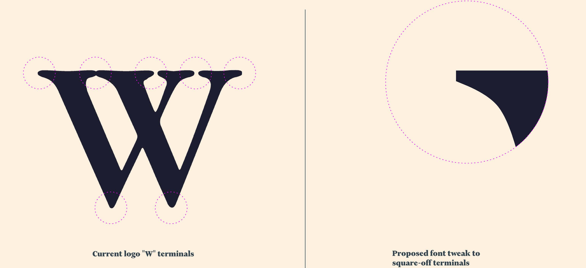
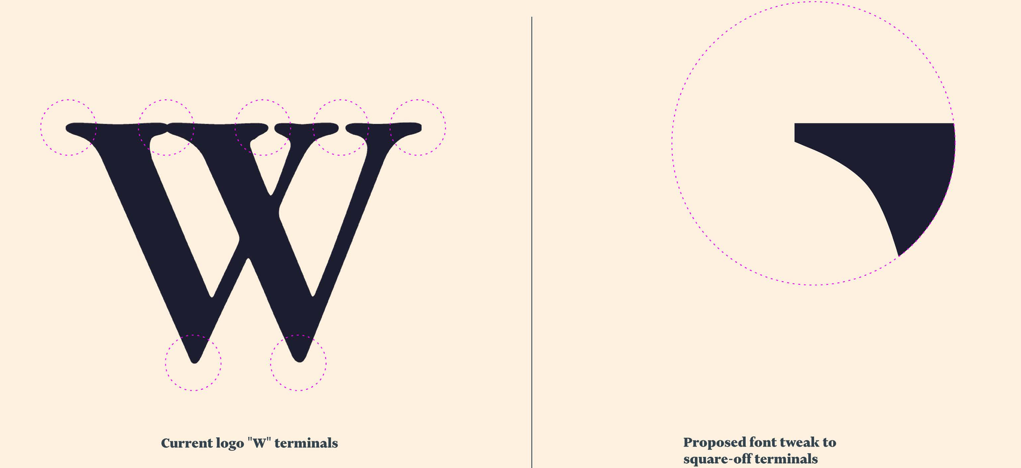
As you can see for the logo, part of this was refined but in essence, we kept what has provoked recall from our audiences.


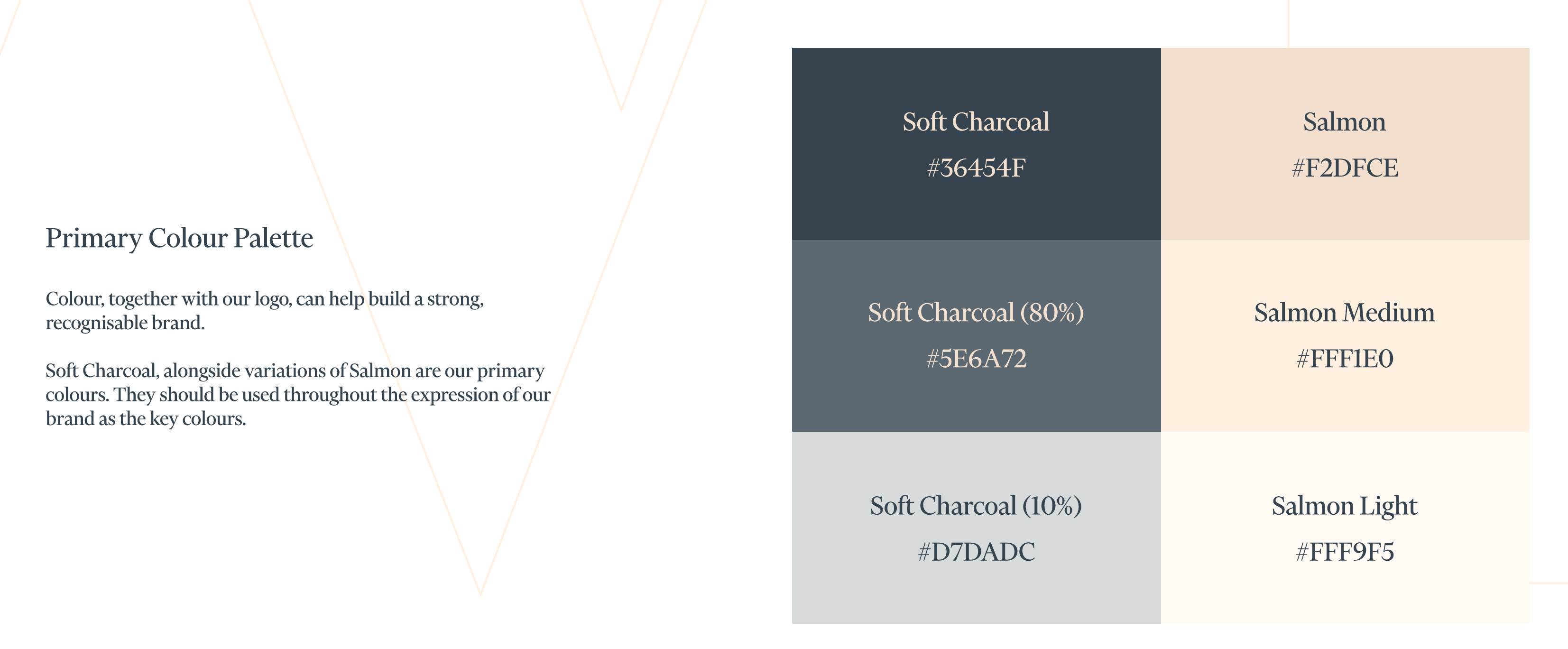
Meanwhile, for the first time in our history, we also defined exactly what our color palette is. This has been hugely helpful across all touchpoints of our brand. See our palette below.

The website in particular was where much of the focus has been, across design, UX and content. In fact, our new website has increased in page numbers by over 100% from our previous old website. What emerged from this project was that we had a chance to showcase our sector experience and the wide number of services we offer, through this new and improved website.
Another key aspect of this new brand identity was to really highlight our work with clients. As a way to do this, we collaborated with Dom Guzman, an excellent illustrator and artist whose editorial imagery has been in the likes of Crunchbase News, amongst others. We’ll talk more about the collaboration with Dom in a coming blog post too.
In a future blog post, we’ll delve into some of the lessons learned from this project.


